

Latest News
- Hyundai E&C Expands Footprint in Global Housing Development Market
- Hyundai E&C to Complete Korea's First AI Data Center in 16 Months
- Hyundai E&C, Seoul National University Hospital, and Seoul National University Jointly Develop AI-Based Next-Generation Healthcare Residential Services
- Hyundai E&C Sets Out to Secure Core Technology for Next-Generation Hydrogen Production via Water Electrolysis
- Hyundai E&C to Build a Future Mobility Safety Framework for Residential Complexes
Why Impressive Spaces Can Be Hard to Navigate- Design of “Flow” Makes Difference Between Comfort and Fatigue
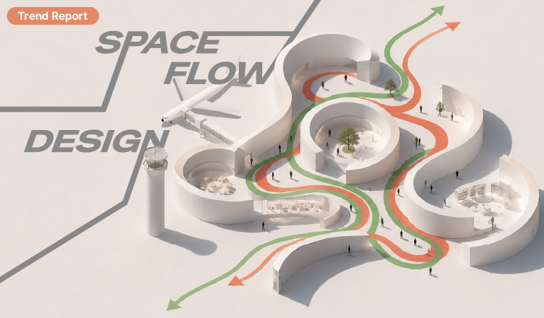
We have all experienced wasting time in a vast shopping mall or airport, wandering in search of the right direction, waiting in line, and looking around to determine where to go next. This familiar situation is not simply the result of a poor sense of direction or visiting a place for the first time. The more a space emphasizes a striking exterior and overwhelming scale, the more likely the movement of people within it is to be overlooked. Although the technology used to construct such structures has advanced significantly, incorporating the way people move through them into the design process is emerging as a new challenge.
The Larger the Space, the More Time Is Lost
In recent years, the core functions of cities have gradually shifted toward large indoor mixed-use complexes. This shift reflects a convergence of factors, including weather conditions in which heat waves and cold snaps have become increasingly common, as well as changing lifestyles that favor completing multiple activities in a single location. Airports, department stores, and cultural complexes are becoming larger, while the density of people occupying them continues to rise.
The problem is that as these spaces expand, the “time cost” imposed on users also increases. The distance from the entrance to the destination becomes longer, circulation routes grow more complex, and the cognitive burden of deciding where to go becomes greater. Ironically, this phenomenon often becomes more pronounced as a space grows more luxurious and grander. The greater the emphasis on overwhelming scale and visual spectacle, the more “invisible time” is spent finding one’s way, waiting, and becoming lost, which may be understood as a form of “Time Tax.” It is an opportunity cost that users never intended to pay, but which is imposed by the structure of the space itself.
Flow Is Determined at the Design Stage, Not During Operations
Common operational measures used to reduce this “Time Tax” include real-time crowd control, CCTV-based congestion detection, and the deployment of guidance staff. However, it is design, not operations, which makes the most fundamental difference.
Bottlenecks, waiting times, and confusion over navigation are not accidental problems caused by crowds. Rather, they are inevitable outcomes created by the structure of the space itself. Whether a space has multiple entrances, whether pathways converge into a single route or branch out in several directions, and whether an open ceiling allows people to understand their location are all structural choices that largely determine how smoothly, or how frustratingly, people move through the space. For this reason, the concepts of “Pedestrian Flow” and “Visitor Flow” are treated internationally as key considerations from the design stage onward.
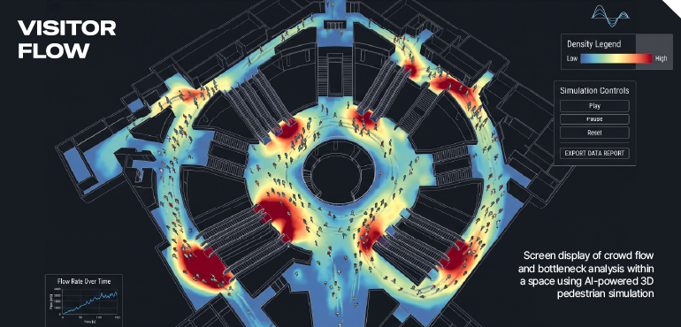
There is no single “right answer” to spatial flow design, as airports, department stores, and city plazas all serve different purposes. However, well designed spaces have one thing in common: they allow people to move naturally without forcing them to adapt to the space. Some spaces disperse people across multiple routes to reduce bottlenecks, while others make it easier for people to understand their location, thereby reducing the burden of wayfinding. Still others use accumulated data to anticipate congestion in advance. Ultimately, spatial flow design is the art of dispersing, connecting, and anticipating.
Four Landmarks That Showcase Exceptional Spatial Flow Design
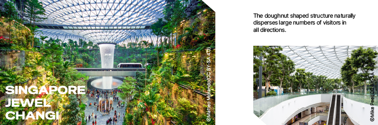
1) Jewel Changi, Singapore: A Doughnut-Shaped Structure That Disperses Foot Traffic
Singapore's Changi Airport, where Hyundai E&C constructed Terminal 2 (opened in 1990), is often hailed as the world's best airport. In 2019, Jewel Changi, known as the "jewel of Changi Airport," opened here. Serving as both a shopping center and a full-scale entertainment complex, Jewel Changi features a doughnut shaped design with an open center, known as a toroid. The moment visitors step inside, their attention is inevitably drawn to the Rain Vortex, a massive indoor waterfall standing 40 meters tall. However, the hundreds of thousands of visitors who pass through the complex each day do not remain concentrated in one location. A circular walkway surrounding the central space, together with connecting routes across multiple floors, naturally disperses people toward their respective destinations.
Safdie Architects, the firm responsible for the design, explains that this form was planned to connect the airport terminal, commercial facilities, and gardens seamlessly while preventing visitor flow from becoming concentrated in specific areas. Furthermore, recognizing that people can easily lose their sense of direction at the center of a circular structure, the architects reduced the stress of wayfinding by strategically placing openings throughout the space. These openings provide views of the surrounding landscape, allowing visitors to understand their location.
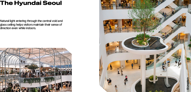
2) The Hyundai Seoul—Voids and Circulation Paths That Reduce Navigation Fatigue
Traditionally, it has long been standard practice for department stores to avoid windows and clocks, the intention being to keep customers in the store so they would lose track of time. The Hyundai Seoul broke this convention head-on. It was designed with a void running through the entire building and a glass ceiling that allows abundant natural light to flood every floor. This was not done merely to create a certain atmosphere. In a large, multi-purpose indoor space, people do not navigate simply by following signs; they determine their location by considering the direction of light, the views between floors, and their sense of distance from the central space. This open central space functions as a "cognitive landmark" that keeps pedestrians from losing their bearings no matter which floor they are on, thereby reducing navigation fatigue.
In addition, from the first to the fifth floors, the circulation paths were designed as a gentle, oval-shaped loop reminiscent of a cruise ship, encouraging visitors to walk around and explore freely. Rather than rushing customers out, the flow was designed so that they would not get tired even during a long visit, thereby increasing the value of dwell time. Leaving a void at the center of the building does, of course, carry an opportunity cost, since it means giving up that much floor space for retail. Yet instead of maximizing retail area, The Hyundai Seoul invested in open space and circulation. As a result, it has established a distinctive identity as a "space where people want to spend time."
3) Incheon International Airport Terminal 2: A Consolidated Design That Brings Dispersed Passenger Flows into One Building
While the previously mentioned Jewel Changi was a "shopping and entertainment space within an airport," a typical airport is a different matter. An airport is where the design of passenger flow - from check-in, through security screening, to the boarding gate - matters most. Getting lost in a shopping mall is only a minor inconvenience, but a tangled flow of passengers at an airport can mean a missed flight.
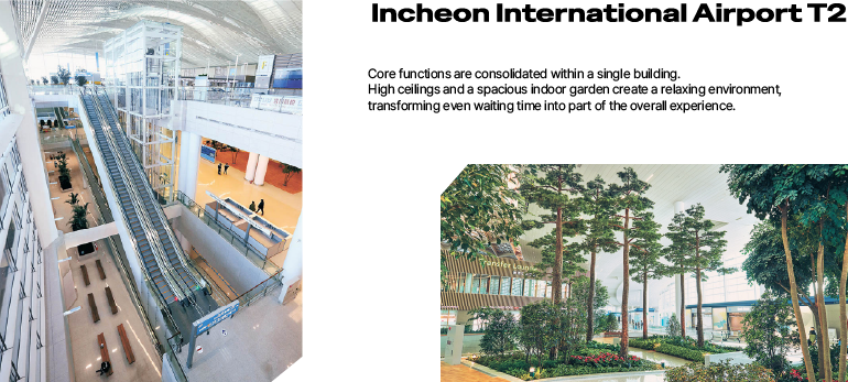
Incheon International Airport Terminal 2, which opened in 2018 with Hyundai E&C overseeing all interior finishing and ancillary facility construction, solved this challenge through spatial efficiency and infrastructure optimization. In Terminal 1, passenger functions were divided, and some passengers had to take a shuttle train to reach the boarding concourse. Terminal 2, by contrast, has a consolidated structure that lets all key passenger-processing procedures be completed within a single building, with no separate boarding concourse. The design paid particular attention to placing transfer counters and security checkpoints close together, shortening the distance transfer passengers must travel and minimizing wasted movement and time.
The terminal also makes large-scale use of proven smart automation, including kiosks, self-service bag-drop stations, and automated wayfinding systems. By using self-check-in and automated baggage drop-off, passengers can cut their departure time by an average of about 20 minutes. The security screening waiting area, meanwhile, has been expanded to nearly three times the size of Terminal 1's, preventing crowd-related bottlenecks before they arise.
By nature, an airport must be a secure and enclosed space. Even so, Terminal 2 uses lofty ceilings and a design that actively draws in natural light to create a sense of openness. It also features an indoor garden more than three times the size of Terminal 1's, turning even waiting time into a comfortable part of the journey. Rather than relying on flashy attractions to draw attention, the space is designed so that passengers can reach their boarding gates smoothly and without obstruction.
4) The Sphere in Las Vegas—Designing a Journey Through “Experiential Transitions”
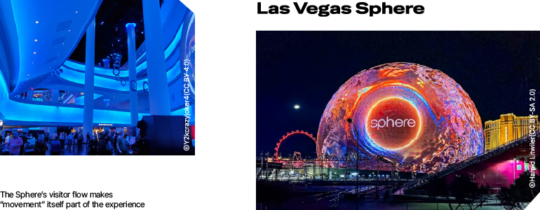
The Sphere is a massive spherical venue that brings performances, shows, and relaxation spaces together under one roof. With a seating capacity of 17,600, according to the official website of the architectural design firm Populous, the venue is wrapped in a 360-degree LED screen that offers an entirely new form of entertainment. Every stage of the visitor journey, from arrival to departure, has been designed as part of a single immersive experience.
Visitors can enter the grand atrium directly via the pedestrian bridge from the nearby Venetian Resort, bypassing the crowds outside. This route naturally draws them away from the noise and congestion of the Las Vegas streets and into a space unique to the Sphere. A particular highlight of this journey is the series of entrance corridors strategically positioned along the route from the lobby to the Main Bowl. As visitors move through these passageways, dramatic changes in spatial scale and acoustics engage all five senses. Rather than simply guiding visitors to their seats, the circulation design gradually transforms the atmosphere, heightening their sense of anticipation. Similarly, multiple vertical circulation routes and expansive common areas connect the entire sequence of movement, from security screening through the lobby and seating areas to the exit, into one cohesive experience.
Because large numbers of audience members must move through the venue within a short period of time, the circulation of people both inside and outside the building is as important as the performance itself. The spacious open atrium, escalators connecting multiple levels, and exterior walkways help maintain a continuous flow even when large crowds move through the venue simultaneously. In this respect, the building creates an invisible rhythm of movement that is just as significant as the overwhelming media technology on display.
Technology Walking Through the Flow Before Construction Begins
How can designers determine in advance whether the circulation routes they have planned will function effectively? One method is pedestrian simulation, a technique that enables designers to virtually “walk through” a space before it is built.
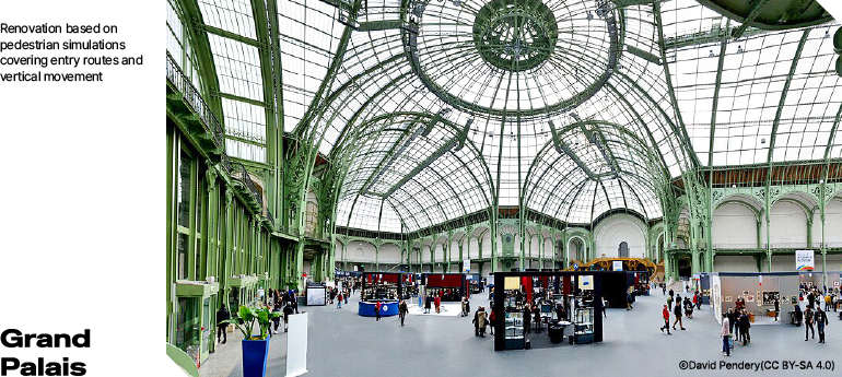
The Grand Palais in Paris is an iconic exhibition hall constructed for the 1900 World’s Fair. Distinguished by its vast glass roof, the historic building underwent a major renovation ahead of the Paris 2024 Olympic Games. To address the challenge of safely accommodating large crowds within a structure more than 120 years old, the project team used PTV Viswalk, a pedestrian simulation software program. The entire visitor journey was tested virtually, including security screening at the entrance, ticketing areas, cloakrooms, vertical circulation routes such as stairs and elevators, and the movement patterns of large groups. The simulation served not only as a validation tool during the design phase but also as a flexible platform for assessing operational performance after completion. In other words, the team used data to verify in advance whether circulation routes planned on paper would remain unobstructed when exposed to real-world crowd conditions.
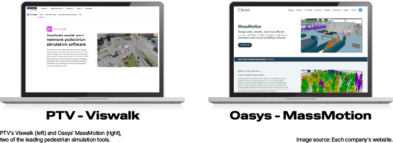
This pedestrian simulation technology is already being used around the world. From the new terminal at New York’s JFK Airport and Grand Central Terminal, through which hundreds of thousands of people pass each day, to Beijing Daxing International Airport, it has been employed across continents to assess crowd movement during the design of large-scale facilities. Two representative tools used for this purpose are the previously mentioned PTV Viswalk and the UK-developed Oasys MassMotion. PTV Viswalk applies the Social Force Model, which accounts for the psychological and behavioral responses of pedestrians, to evaluate corridor widths, the capacity of waiting areas, and walking and waiting times. Oasys MassMotion has similarly become an established tool for continuous pedestrian-flow analysis and proactive crowd management throughout the entire building lifecycle, from design and construction to operation. These tools use color-coded visualizations to show how crowded different areas of a space are likely to become. They also display the Level of Service (LOS), an internationally recognized measure used to classify pedestrian congestion. Areas that turn red indicate potential bottlenecks that need to be addressed during the design phase. By enabling circulation patterns to be tested in advance, these technologies connect the design of the building itself with the design of how people will move through it.
The Era of Construction That Designs People’s Time
Digital twin and simulation technologies, which have traditionally focused on structural safety and construction efficiency, are now advancing toward a new dimension of value: understanding how people move through space. AI-based behavioral prediction functions as a navigator, identifying potential bottlenecks in building plans before they occur and refining the invisible rhythms of movement within a virtual environment. Ultimately, the quality of a future space will not be determined solely by how spectacularly the building itself is constructed. It will also depend on how effectively the space reduces the “time tax” imposed on those who move through it and accommodates their flow through advanced simulation and validation technologies. Integrating the act of building with the act of moving through a building from the earliest stages of design may be the most thoughtful consideration that the construction industry can offer everyone who uses the space.
Join Hyundai E&C newsletter.
Hyundai E&C Newsletter
Meet the various stories from Hyundai E&C Newsletter every month.
Subscribe to Hyundai E&C newsletter and get the latest news via e-mail.
- Name
-
-
@
- Part
-
- country
-
Privacy Policy
We may collect the personal information for the following purposes.
- Information
- Name, E-mail, and Part
- Subject
- Apply and Discribe for the Newsletter, Deliver Newsletter
- Period
- Your personal information will deleted in 5days of work day.
- Name
-
-
@

Registration Number 101-81-16293, 03058 Hyundai Bldg., 75, Yulgok-ro, Jongno-gu, Seoul
© HYUNDAI E&C. ALL RIGHTS RESERVED.